Compare original Gibson headstock photographs from early pegheads through “The Gibson” script, the wartime banner, the 1950s block logo, the Norlin years and two modern wordmark periods.
A headstock logo can place a Gibson in a broad production era, but it rarely gives one exact year. Changes reached different models at different times, and Gibson used more than one construction method for the lettering.
Start with the logo, then compare it with the serial number, Factory Order Number, pot codes, tuners, neck construction and model features. If those clues point to the same period, the date is much stronger.
Choose the Right Timeline
Pearl, Silkscreen And Off-Face Gibson Logos
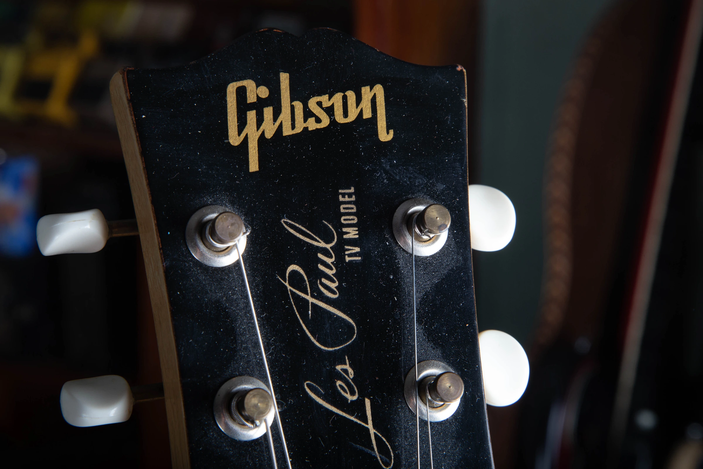
The open-letter, closed-letter and dot rules in the block-logo portion of this guide apply primarily to pearl or pearl-style headstock logos. A gold silkscreen can draw the same letters differently, so it needs to be compared with the correct model line instead of forced into the pearl timeline.
This 1957 TV Model has a gold silkscreen with closed letter shapes and a separate dot. It shows why silkscreened logos need their own model-specific timeline.
Identify The Material Before The Letter Shape
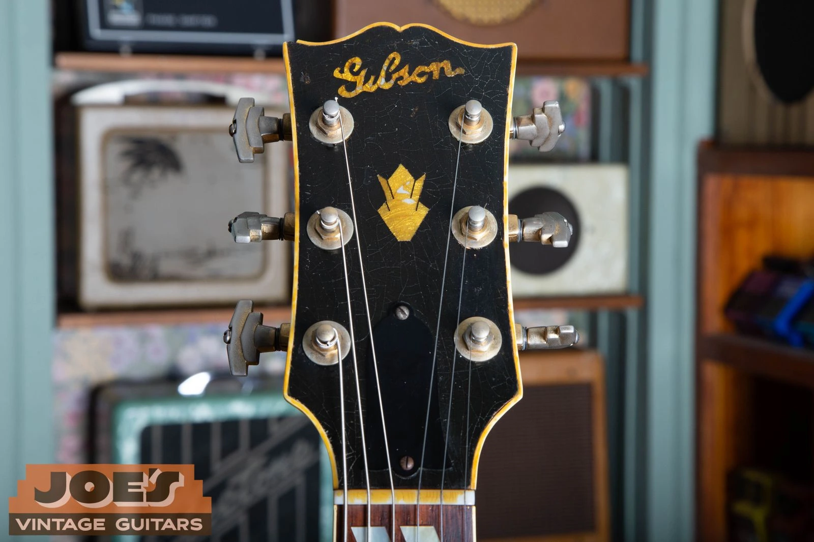
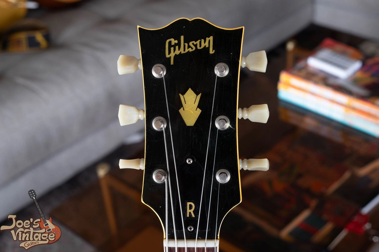
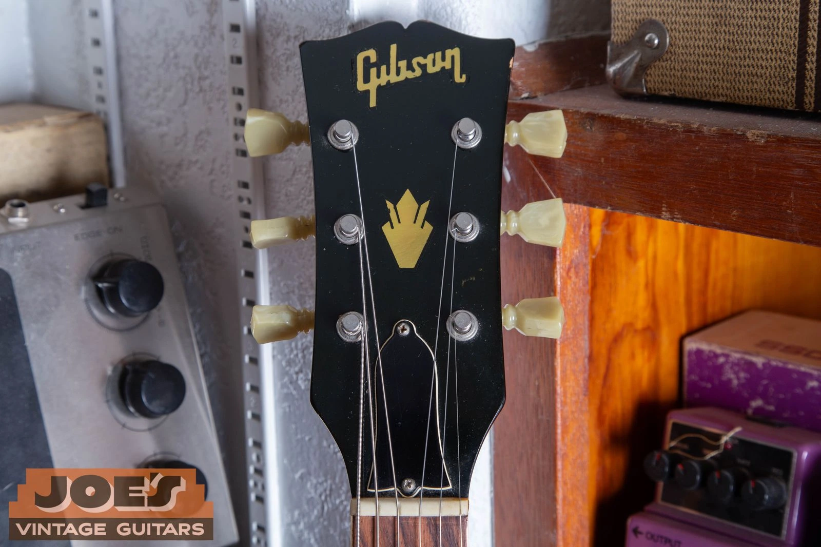
Junior, TV Model, Melody Maker and several acoustic lines use painted or silkscreened marks in periods when higher-trim models use pearl. The model name below the logo, crown, flowerpot or split-diamond inlay can identify the trim level, but those ornaments are model clues rather than one universal date code.
A Blank Face Can Be Normal Later
Some Flying V and Firebird designs place Gibson identification on the truss rod cover or elsewhere instead of the peghead face. A blank face must be read with the model. For construction details beyond the logo, use the Gibson physical features and hardware guide.
Quick Reference
Gibson Headstock Logo Timeline At A Glance
These are working date ranges. The photo sections below explain the overlap and the details to inspect.
Use the enlarge control to inspect the letter shapes in each original photograph.
Enlarge photoAbout 1902 to 1910: Early Gibson Pegheads
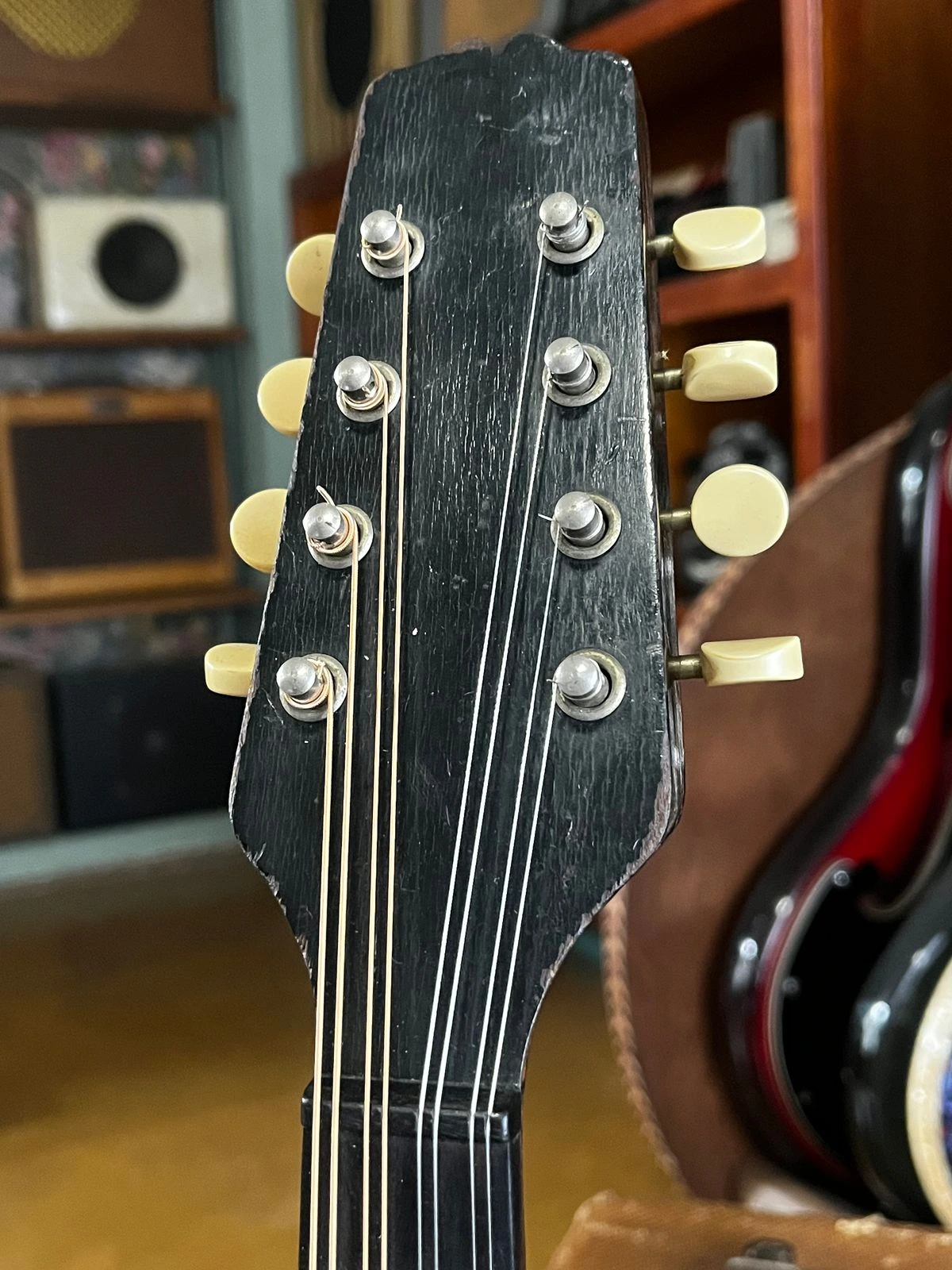
This early eight-string Gibson mandolin has a blank peghead face. Other instruments from the same broad period can have a slanted script or decorative mark.
Logo 01
Early Gibson Pegheads, About 1902 To 1910
The earliest Gibson pegheads are not one uniform logo era. Surviving instruments can be blank, carry a slanted “The Gibson” script, or use other early decoration. The label, serial number and construction do more of the dating work.
Early Peghead Details
Logo treatment varies
Interior label matters
Instrument type matters
Dating limit: A blank face is not an early-Gibson date code. Later models can also have no Gibson name on the peghead face, and a refinish can remove an earlier mark.
Enlarge photoBy 1906 To About 1928: Slanted “The Gibson” Script
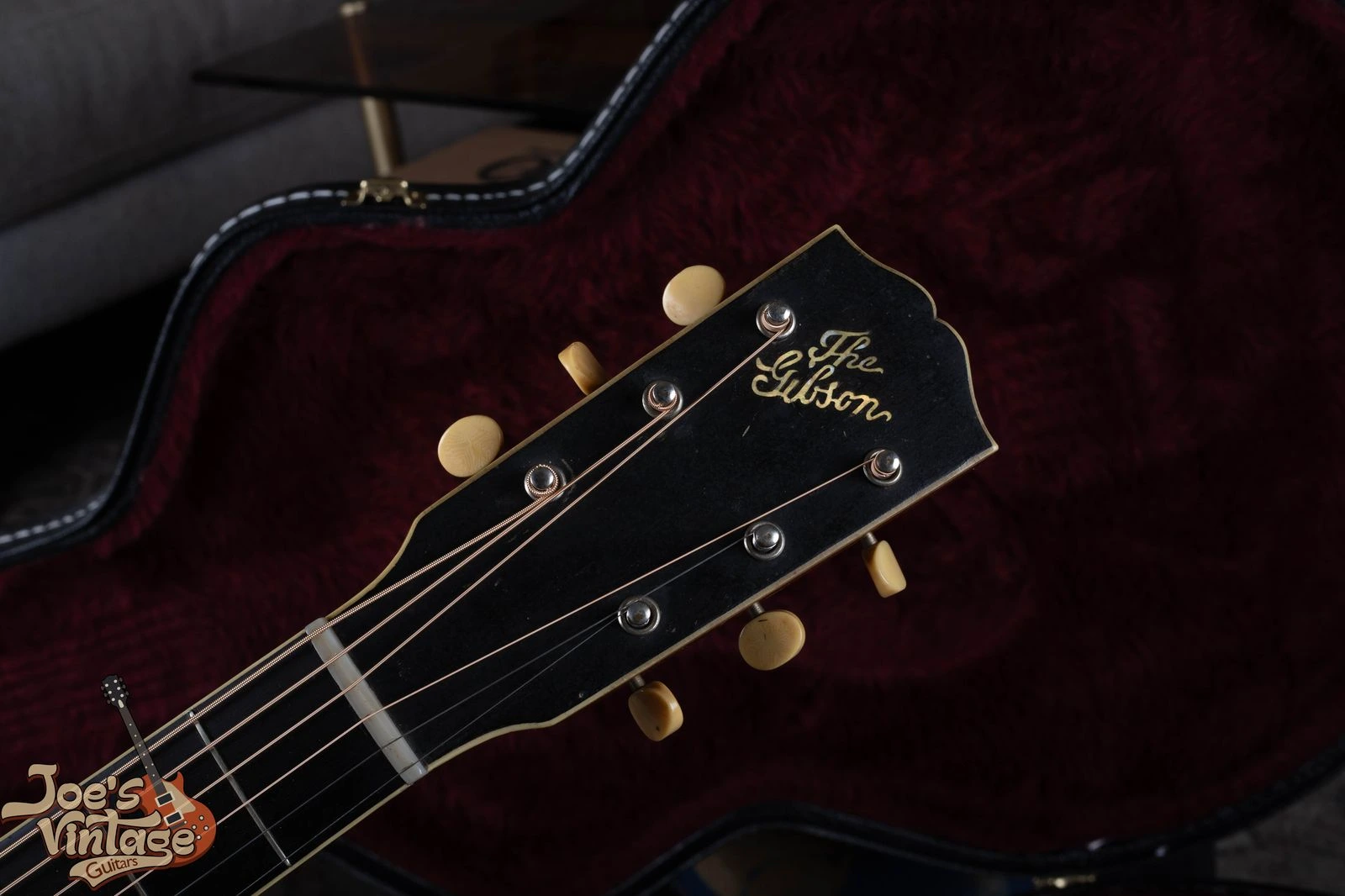
The early “The Gibson” logo is set at an angle and uses thin, flowing script. This example is on a Gibson L-4.
Logo 02
Slanted “The Gibson” Script, By 1906 To About 1928
The best-known early logo spells out “The Gibson” in pearl script and runs diagonally across the peghead. The fine, hand-lettered appearance is very different from the postwar block logo.
How To Spot The Slanted Script
Includes the word “The”
Thin calligraphic letters
Logo rises at an angle
Dating limit: The slanted script is documented by the mid-1900s, earlier than a strict 1908 starting date. Blank and decorated pegheads overlap it, and some instruments kept the slant into the late 1920s.
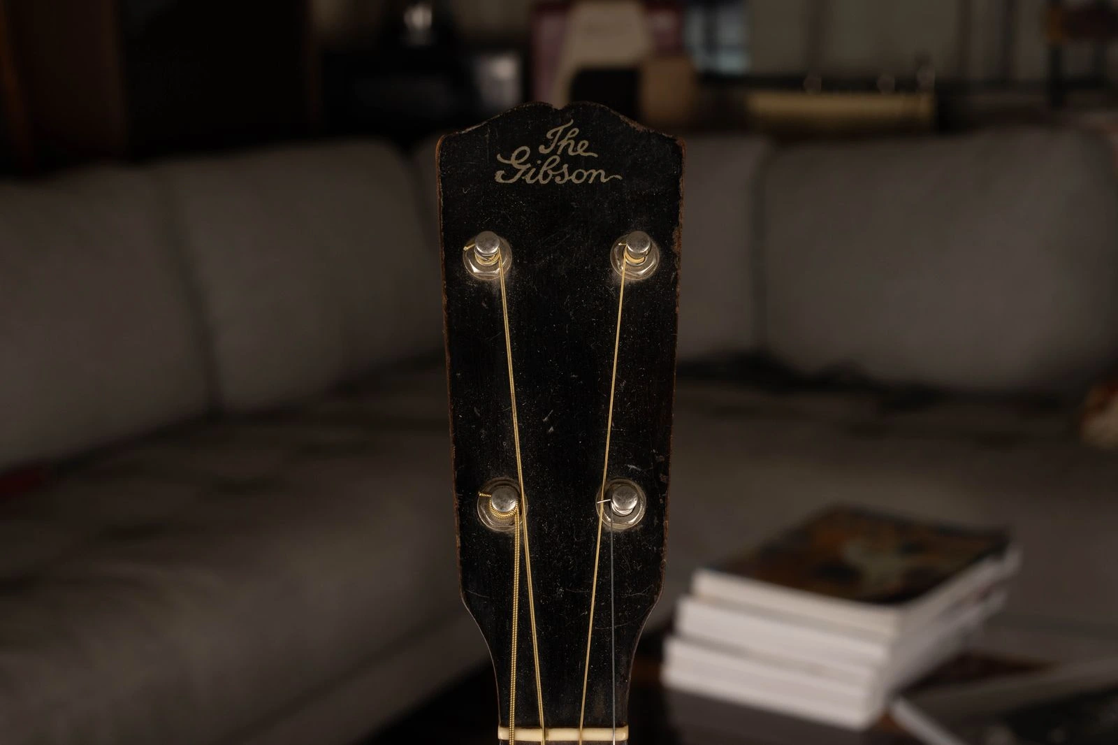
Enlarge photoAbout 1928 to 1932: Straight “The Gibson” Script
This four-string instrument keeps the words “The Gibson,” but the logo reads straight across instead of climbing diagonally.
Logo 03
Straight “The Gibson” Script, About 1928 To 1932
Gibson straightened the earlier script across the top of the peghead before it dropped “The” from the brand mark. This is a useful prewar clue because both the wording and the angle are easy to compare.
How To Separate The Straight Version
Includes the word “The”
Runs straight across
Fine script rather than block letters
Dating limit: Slanted and straight versions overlap in the late 1920s. Some flat-top models also dropped “The” before other parts of the line.
Enlarge photoAbout 1930 to 1936: Thin “Gibson” Script
The logo now says only “Gibson.” The narrow strokes separate this prewar form from the heavier script used later in the decade.
Logo 04
Thin “Gibson” Script, About 1930 To 1936
The article disappears, leaving “Gibson” in a fine horizontal script. Look at the narrow strokes and the amount of open space inside and around the letters.
Thin Script Identification Clues
Says “Gibson” only
Thin, delicate strokes
Straight horizontal placement
Dating limit: Logo details varied by model and by whether the mark was inlaid or applied. Use the FON and body features to confirm an early 1930s estimate.
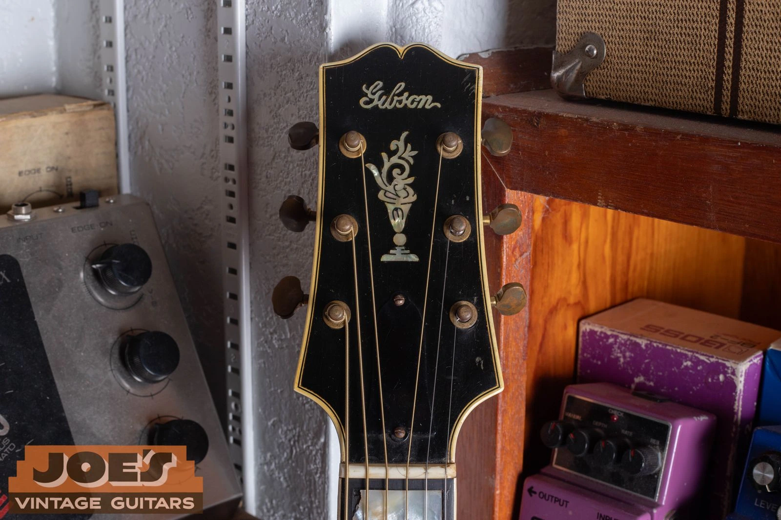
The script remains familiar, but the strokes are much heavier. This bold form leads into the wartime banner period.
Logo 05
Bold Prewar Script, About 1935 To 1941
By the end of the 1930s, the script became thicker and more forceful. It still reads as handwriting, not the squared block lettering introduced after the war.
Bold Prewar Script Details
Thick script strokes
No word “The”
No wartime banner
Dating limit: Thin and bold scripts overlap during the 1930s, and the material can differ by model. Treat this as a supporting range rather than a factory-wide cutoff.
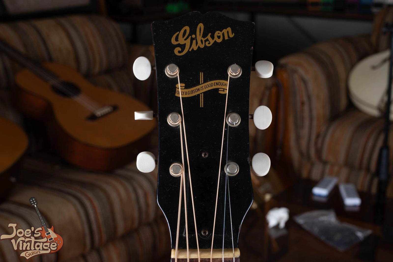
The gold silkscreened ribbon reads “Only a Gibson Is Good Enough.” The banner is one of Gibson’s clearest wartime dating features.
Logo 06
Wartime Banner Logo, 1942 To 1945
The wartime banner sits below the gold script logo and carries the “Only a Gibson Is Good Enough” slogan. It is strongly associated with J-45, Southern Jumbo, LG-2 and related wartime flat-tops.
Wartime Banner Identification Clues
Gold script “Gibson”
Ribbon below the name
Slogan printed inside the ribbon
Dating limit: Not every wartime model received the banner, and some premium instruments retained pearl script. Modern reissues reproduce the banner, so confirm a claimed wartime guitar with its FON, label and construction.
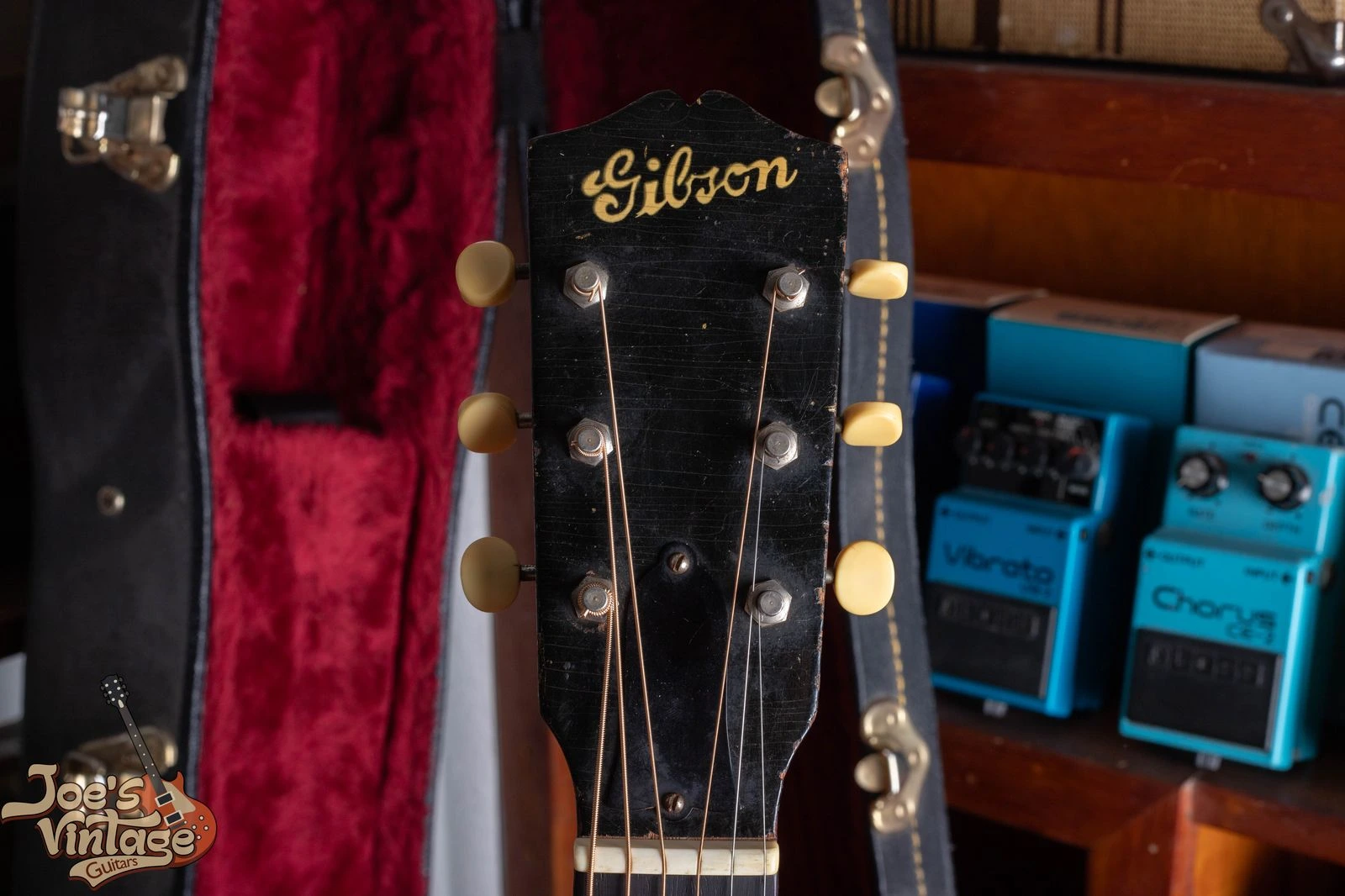
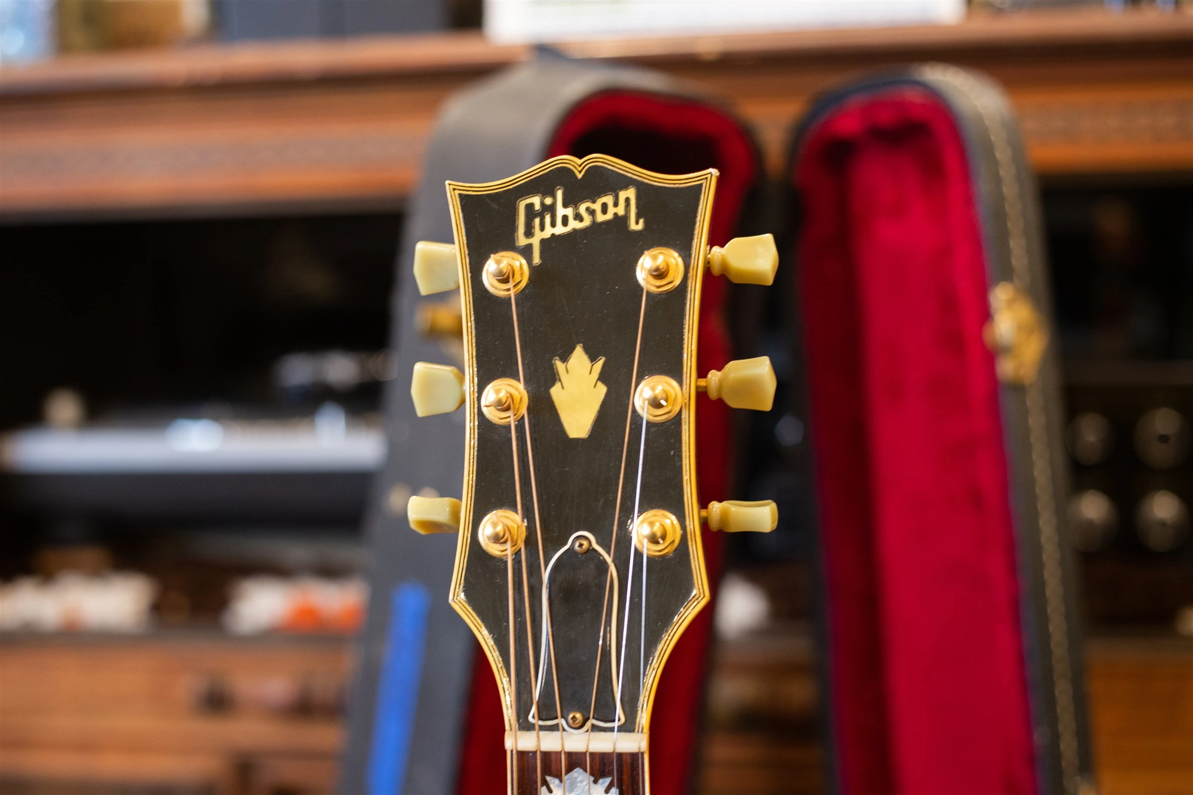
This 1946 example has a pearl script logo and crown beneath ambered lacquer. The wartime banner is gone, but block lettering has not yet arrived on this model.
Logo 07
Post-Banner Script, About 1946 To 1948
After the wartime ribbon disappeared, script logos continued briefly. Depending on the model, the name may be pearl inlay or a gold silkscreen rather than one universal construction.
Post-Banner Transition Clues
Script “Gibson”
No banner ribbon
Pearl or silkscreen by model
Dating limit: The script-to-block change spread across model lines from about 1947 through 1949. Confirm this transition with the FON, label and construction.
This 1949 example shows the new block lettering with open “b” and “o” forms and the dot over the “i” joined to the “G.” The gold R on the truss rod cover is separate from the Gibson wordmark.
Logo 08
First Block Logo, About 1947 To 1952
Gibson replaced the prewar script with the block-style wordmark that became the basis of the modern logo. On early examples, the “G” is curved, the “b” and “o” are open and the dot over the “i” touches the “G.”
First Block Logo Details
Block rather than script letters
Open “b” and “o”
Dot over “i” touches the “G”
Dating limit: The block logo arrived model by model, and the joined dot survives on documented 1952 examples. Do not force every instrument into one 1950 cutoff.
Enlarge photoEarly 1950s to late 1968: Golden-Era Block Logo
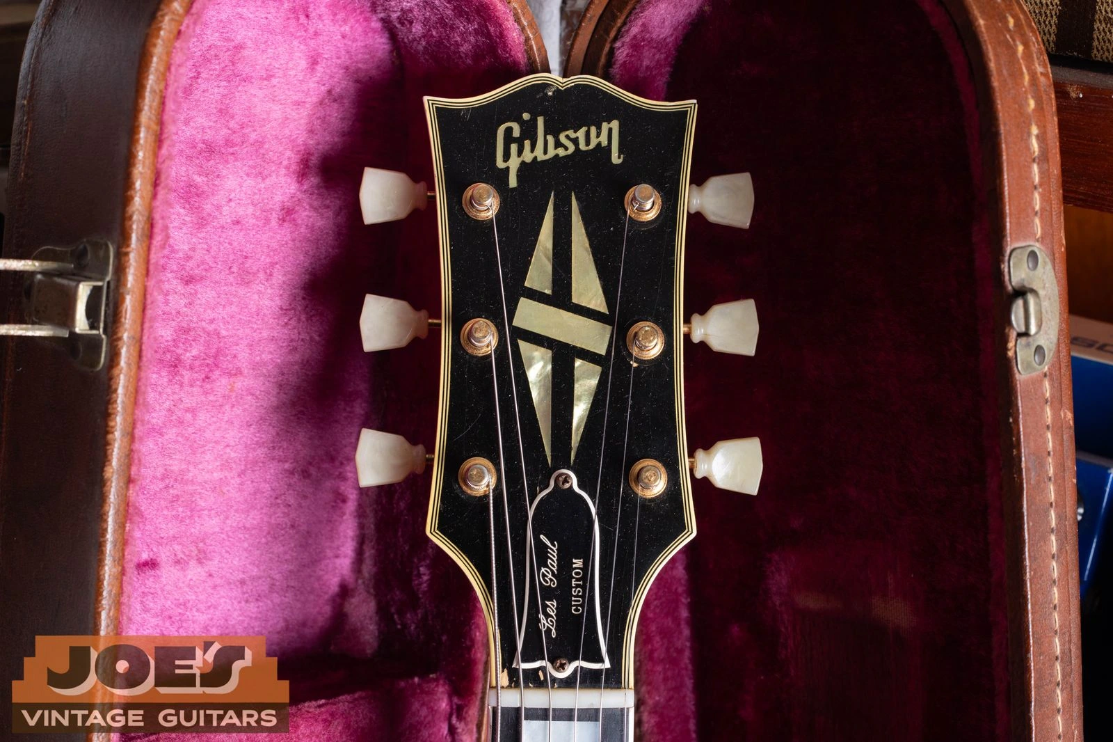
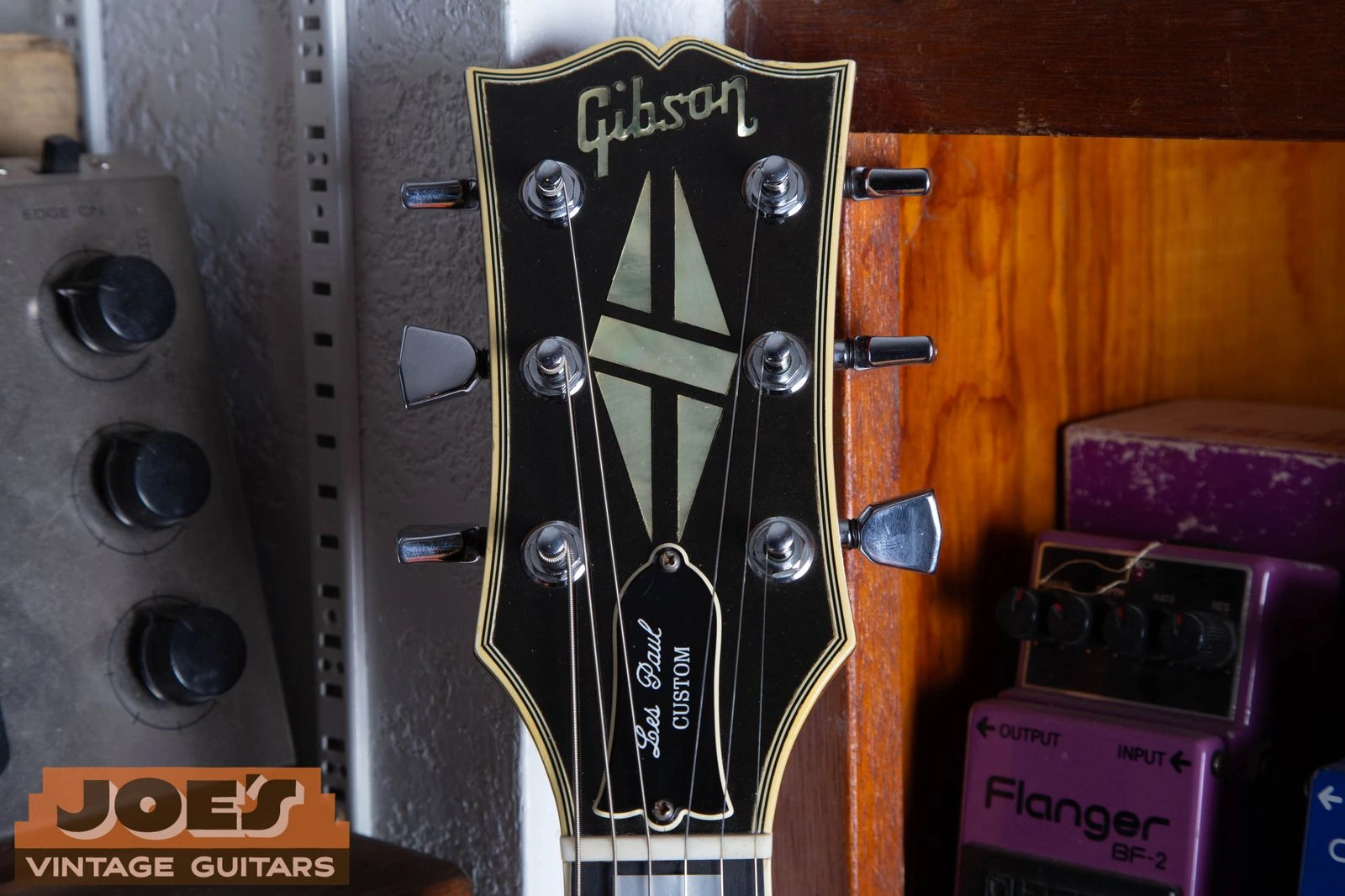
A 1958 Les Paul Custom with the familiar golden-era logo: slanted letters, open “b” and “o,” and a separate dot above the “i.”
Logo 09
Golden-Era Block Logo, Early 1950s To Late 1968
The 1950s and most of the 1960s use the familiar slanted block logo. The “b” and “o” remain open, while the dot above the “i” floats separately instead of joining the “G.”
Golden-Era Pearl Logo Clues
Open “b” and “o”
Separate dot above the “i”
Pearl inlay on this example
Dating limit: These letter-opening rules describe the pearl block logo. Silkscreened logos on lower-priced and acoustic models can form the letters differently during the same years.
Enlarge photoLate 1968 to early 1970s: No-Dot Transitional Logo
This 1969 example has curved, open letters but no dot above the “i.” The missing dot is the useful clue here, not a claim that every 1969 logo is square.
Logo 10
No-Dot Transitional Logo, Late 1968 To Early 1970s
The missing dot above the “i” is the easiest late 1960s clue. Letterforms vary through the transition, including open and closed “b” and “o” shapes.
How To Read The No-Dot Transition
No dot above the “i”
Curved or squared forms occur
Open and closed letters overlap
Dating limit: A missing dot does not prove the guitar was made in 1969. It appears most often around 1969, with examples in late 1968 and the early 1970s.
Enlarge photo1970s to early 1980s: Closed-Letter Norlin Logo
A 1979 Les Paul Custom with a separate dot, closed “b” and “o” forms and the “o” joining the “n” near the bottom.
Logo 11
Closed-Letter Norlin Logo, 1970s To Early 1980s
Closed “b” and “o” shapes are common in the 1970s. The dot returns gradually rather than on one factory date, and the lower “o” to “n” connection helps separate this form from the next one.
Norlin-Era Letter And Join Details
Closed “b” and “o” common
“o” joins “n” near the bottom
Dot may be present or absent
Dating limit: Dated 1972 and 1973 guitars can still be dotless, while the dotted closed-letter form continues into the early 1980s. Check the serial, volute and neck construction with it.
Enlarge photoAbout 1981 to early 1990s: Squared Modern Logo
Joe’s 1986 J-200 shows the transitional modern construction: squared, closed letters remain, but the “o” now joins the “n” near the top.
Logo 12
Squared Modern Logo, About 1981 To Early 1990s
Around 1981, the “o” to “n” connection moves from the bottom toward the top while the letters can remain squared and closed. This makes the high join more useful than roundness for this period.
Early Modern Logo Details
“o” joins “n” near the top
Closed “b” and “o” can remain
Squarer overall letterforms
Dating limit: The change is approximate and model dependent. A serial number and model features should distinguish an early-1980s guitar from a late Norlin example.
Enlarge photoMid-1990s to present: Rounded Modern Logo
A 2000 Les Paul Custom with the rounded modern wordmark. The “b” and “o” are more open, and the “o” joins the “n” near the top.
Logo 13
Rounded Modern Logo, Mid-1990s To Present
By the mid-1990s, the familiar modern wordmark has more rounded and open letterforms while retaining the high “o” to “n” connection and a separate dot above the “i.”
Current Wordmark Details
Rounded, open letterforms
“o” joins “n” near the top
Separate dot above the “i”
Dating limit: Historic and anniversary models intentionally reproduce older logos. On those guitars, the serial and construction establish the build date; a certificate is supporting evidence, not proof by itself.
When the Clues Do Not Agree
Why A Gibson Logo May Not Match The Guitar’s Date
Gradual Factory Changes
Different model lines did not change on one factory-wide date. A transition-year guitar can correctly carry either neighboring logo style.
Replacement Neck Or Repair
An older Gibson can have a later neck, headstock veneer, logo or finish while retaining its original body. Inspect the joint and surrounding finish before assigning a cause.
Historic Reissue
A modern reissue is supposed to copy an earlier logo. Start with its serial format and construction. A certificate can support the identification, but early Historics may lack one and loose certificates can be separated from their guitars.
Refinish Or Replacement Veneer
A refinished face can remove, redraw or replace the original mark. Look for finish disturbance around the binding, tuner holes and headstock edges.
Cross-Date The Headstock Before You Decide
1
Decode the numbers. Check both the serial number and the FON if the guitar has one.
2
Check dated parts. Original pot codes can establish the earliest possible assembly date.
3
Match the model. Compare pickups, tuners, neck construction, hardware and finish with the claimed year.
4
Look for repairs. A blacklight and close inspection can reveal a replacement neck, refinish or veneer, but an old or complete refinish may not produce an obvious contrast.
Can A Gibson Headstock Logo Give Me An Exact Year?
Usually not. A logo is best used to narrow the guitar to an era. Gibson changed different model lines at different times, so the serial number, Factory Order Number, pot codes and construction still need to agree.
Does A Missing Dot Over The “i” Mean My Gibson Is From 1969?
It strongly suggests the late 1960s or early 1970s, and it is especially common in 1969. It is not an exact one-year code because the transition began in late 1968 and continued on some instruments after 1969.
Why Does The Logo Look Newer Than The Rest Of The Guitar?
The guitar may have a replacement neck, a repaired or replaced headstock veneer, or a refinish. Compare the neck joint, finish, serial number and construction before deciding what changed.
Do All Gibsons From The Same Year Have The Same Logo?
No. Acoustic, archtop, solid-body and lower-priced model lines did not always change together. Inlaid, painted and pantograph-style versions can also differ within the same general period.
Can The Logo Prove That A Gibson Is Authentic?
No. A correct-looking logo is supporting evidence, not proof. The serial number, FON, neck and body construction, hardware, electronics, finish and model specifications all need to match.